Phase 1
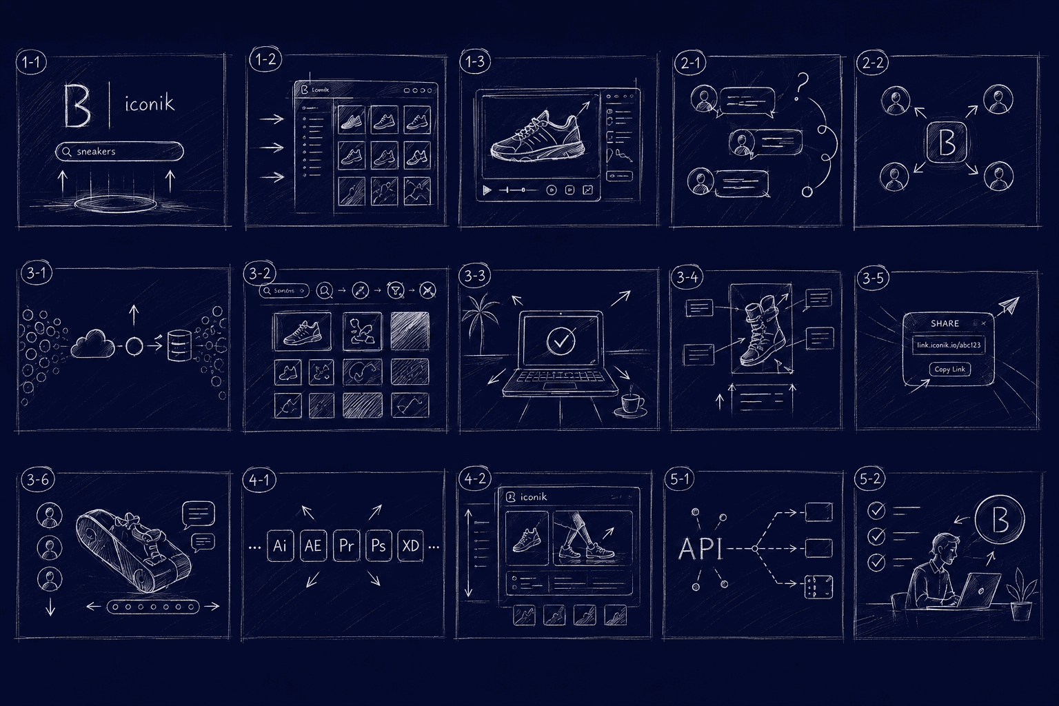
Storyboarding
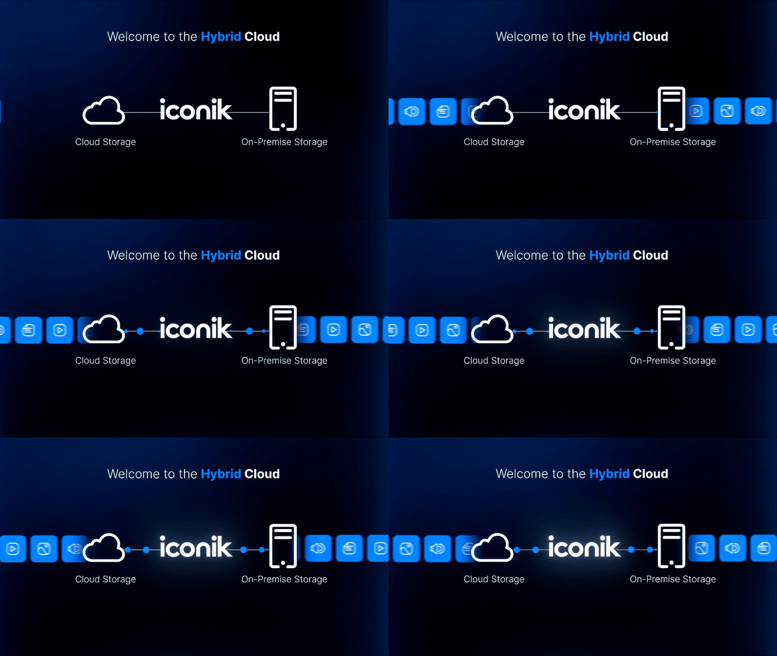
With nothing physical to shoot, the script and board had to carry the entire idea before a single frame moved. We tested the visuals as branded stills first, so the argument was approved before we spent the animation budget.
Phase 2
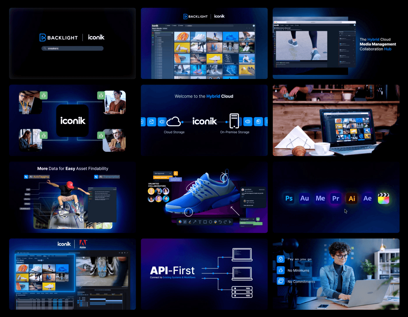
Styleframing
Lock alignment before you spend a dollar on motion.
Approved boards became styleframes and a motion plan. By the time production started, nobody was interpreting. Everybody was executing.
Phase 3
Animation
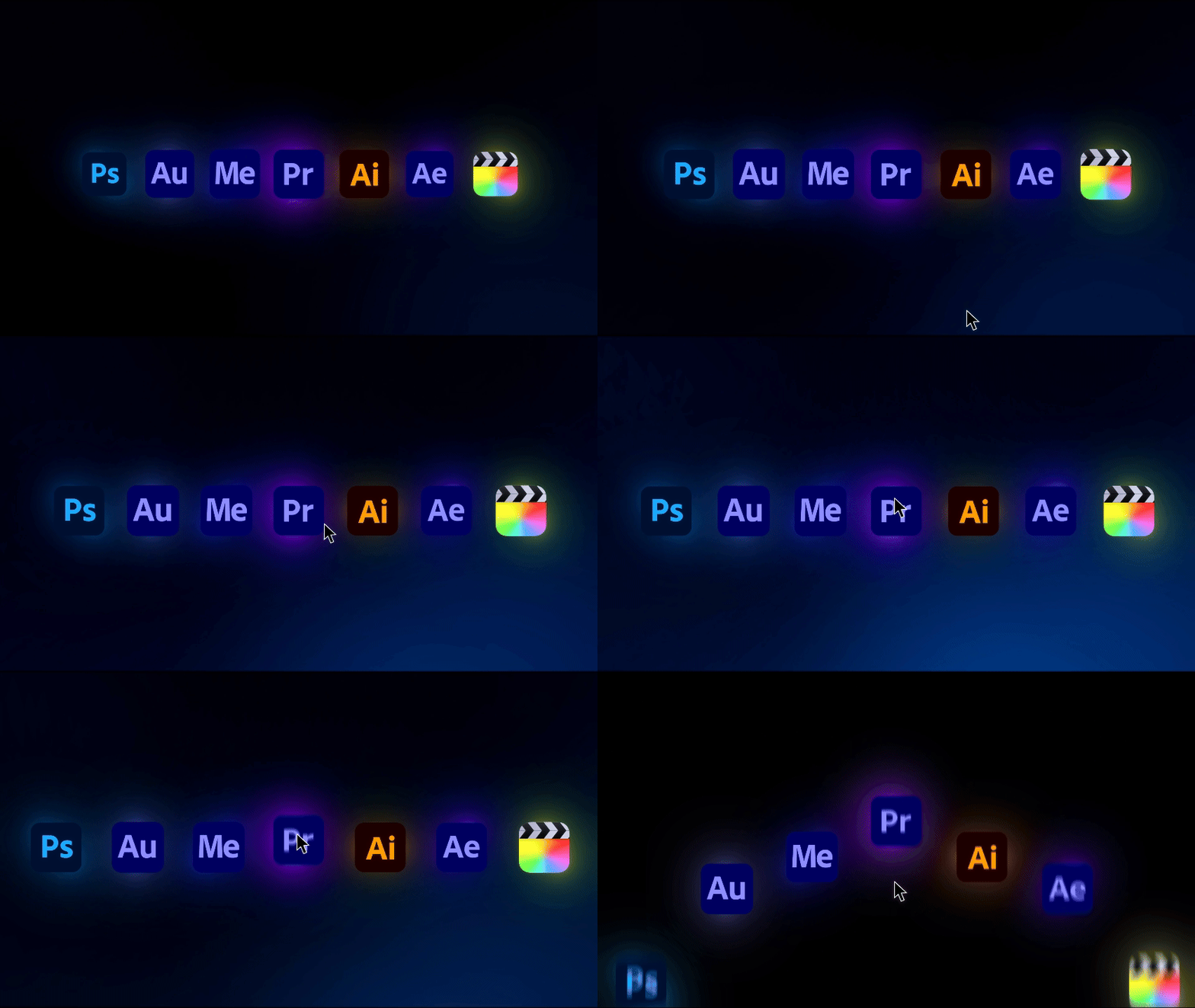
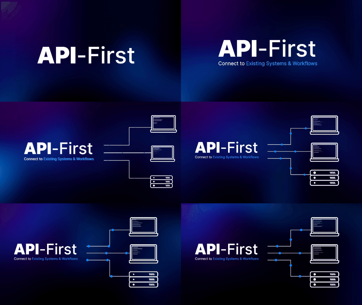
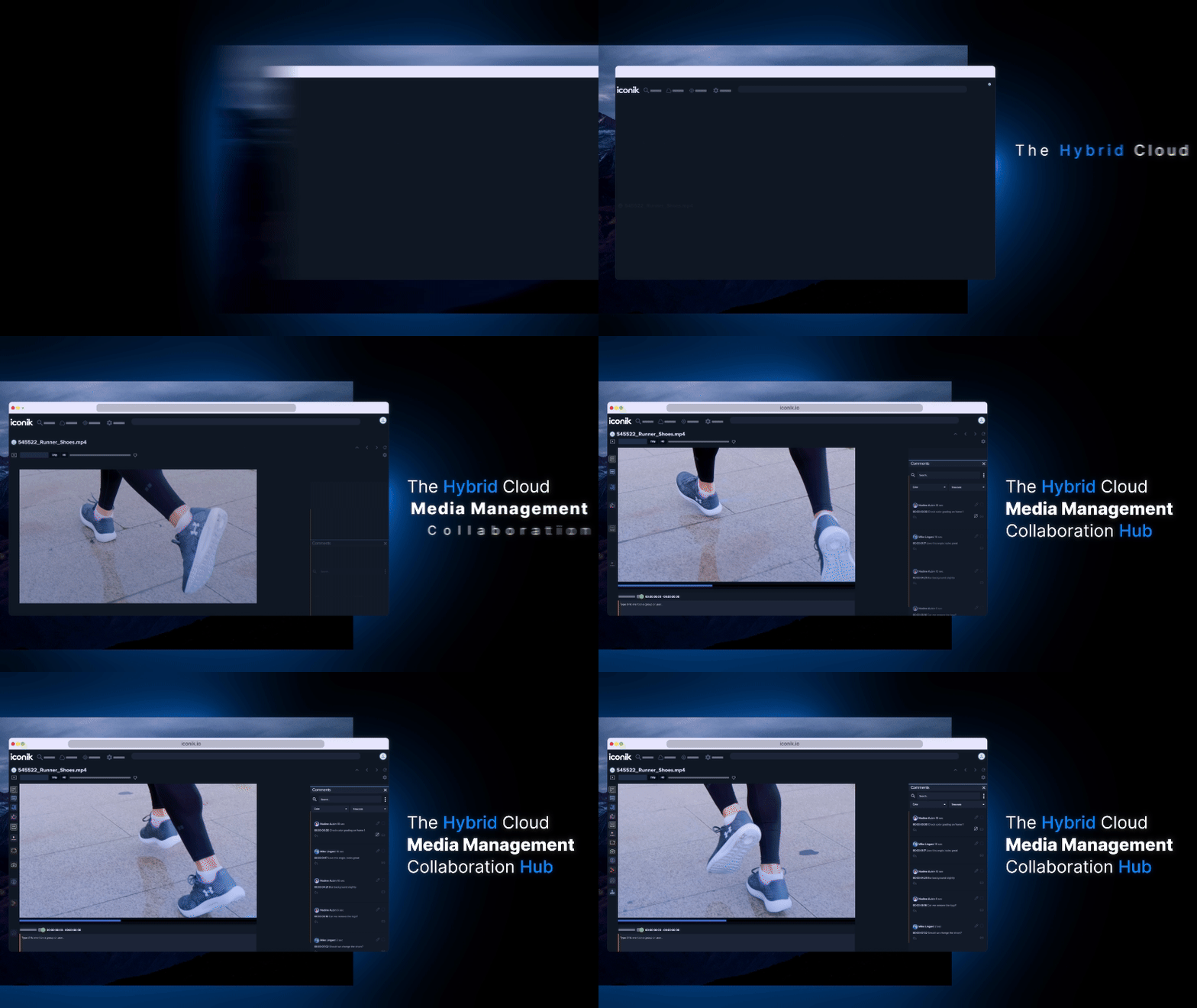
Making abstract workflows feel tangible through motion alone.
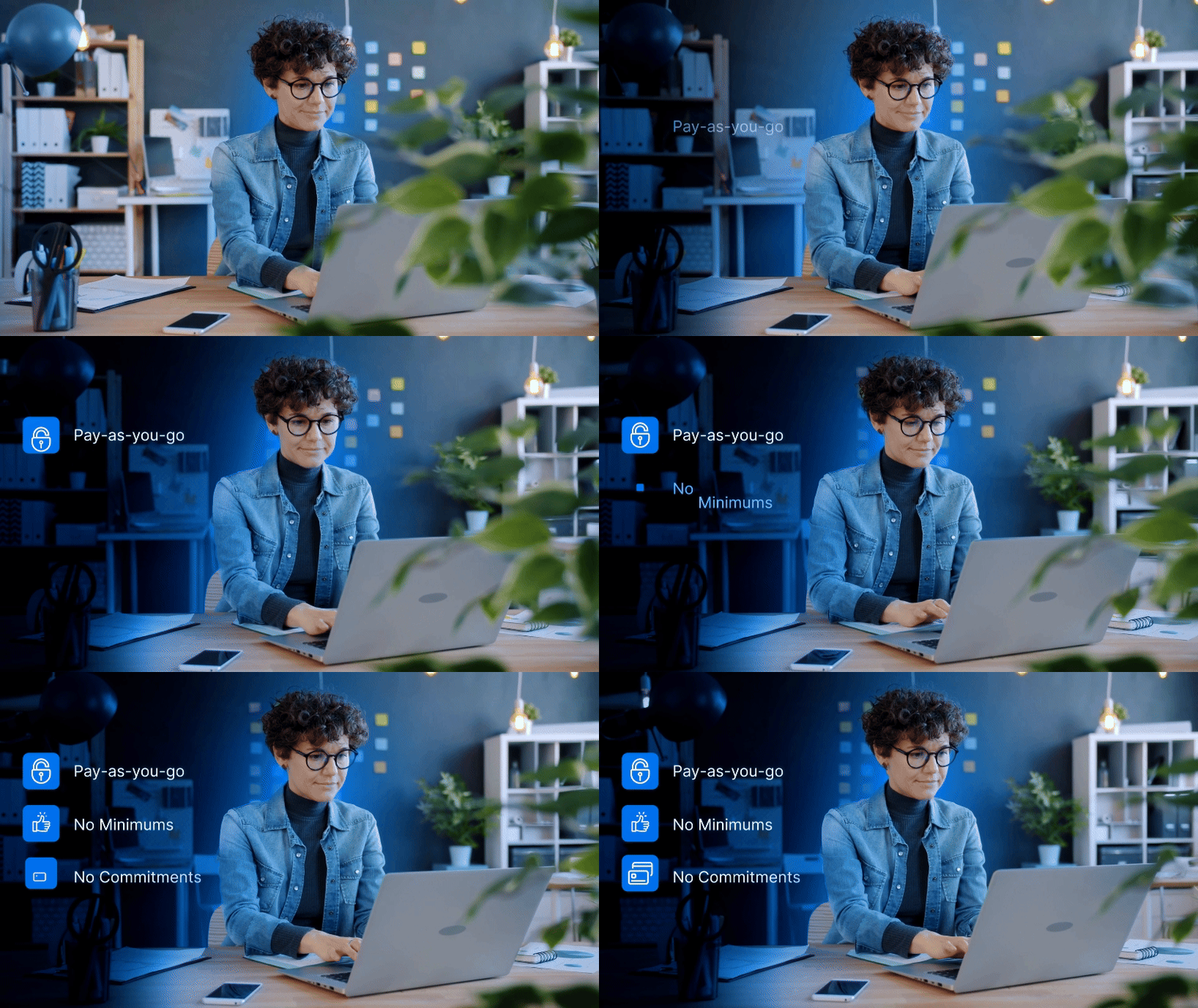
Fluid tracking, vector motion, transitions that carry information instead of filling time. Every frame is a decision. There isn't one stock UI pan in it. Fittingly, the whole project was produced entirely remotely, a working demo of the exact collaboration Iconik sells.