Phase 1
Publication Design
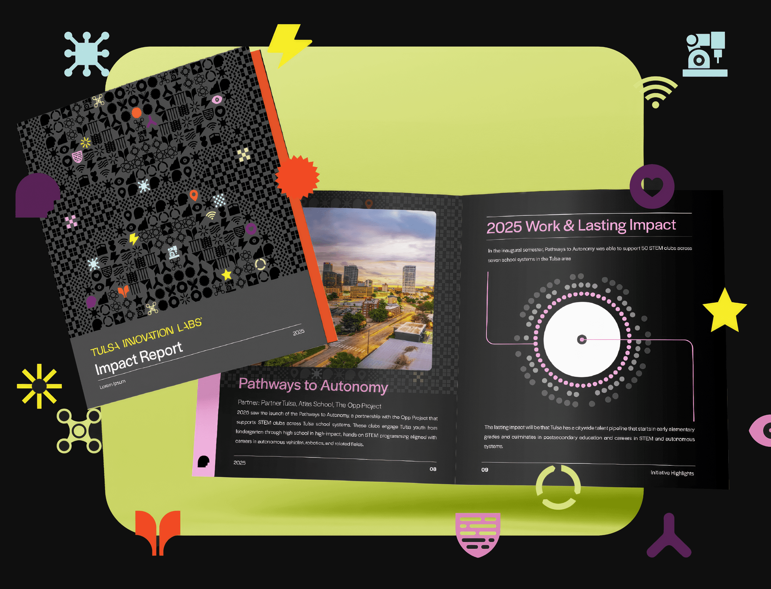
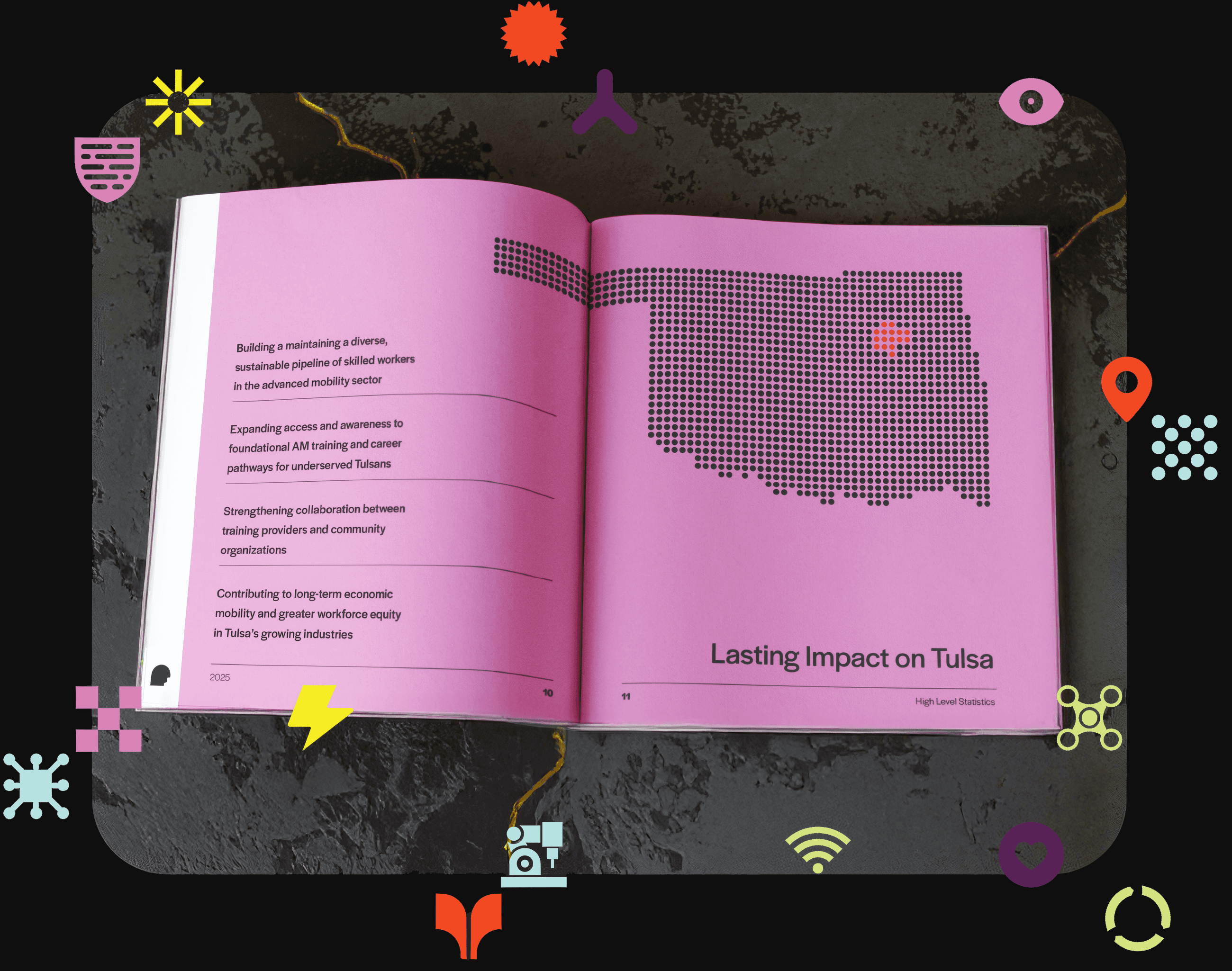
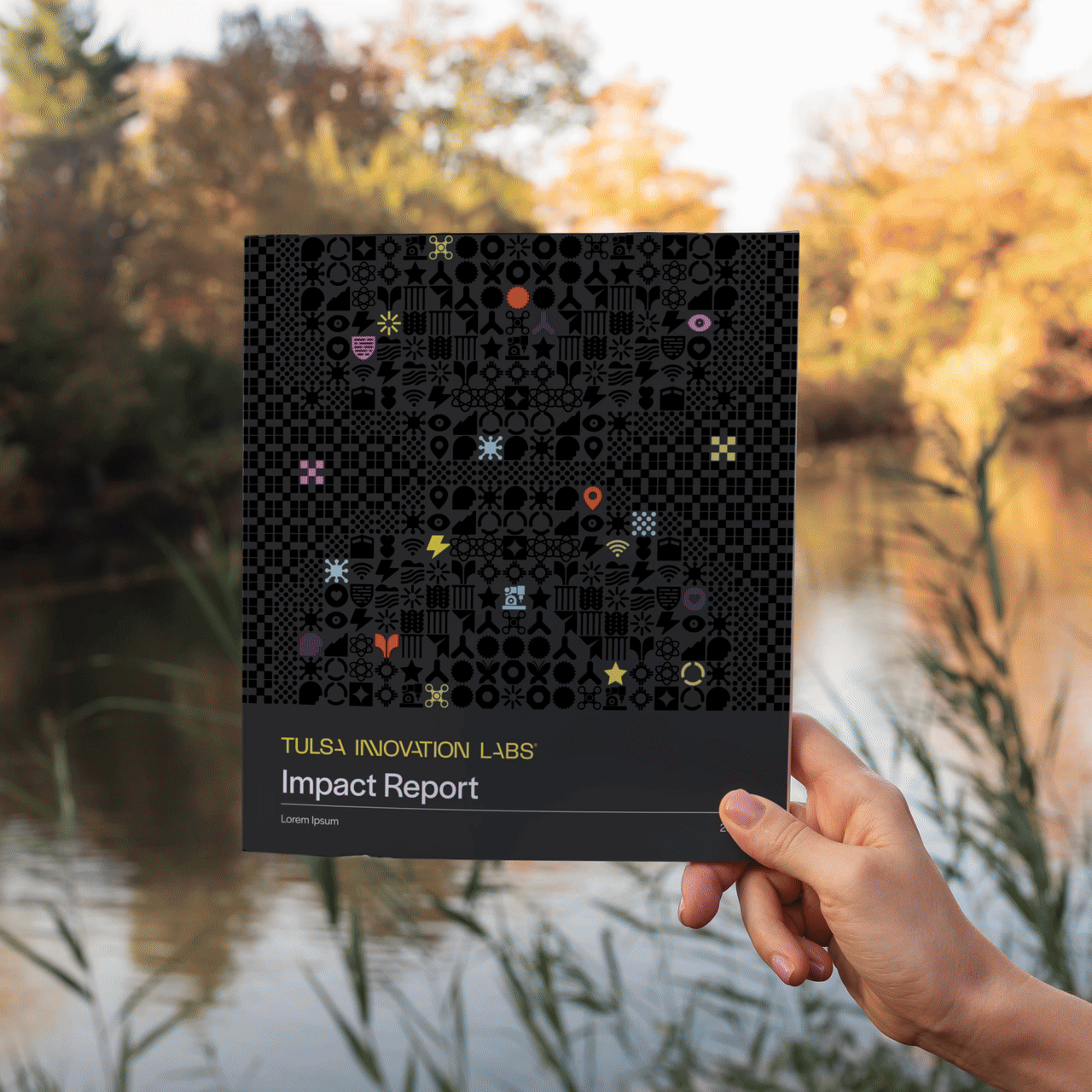
The project started as a print publication. We established a visual language built on TIL's own icon system, using it to generate a modular cover pattern that feels distinctive without relying on photography. Interior spreads used TIL's bold multi-color palette as a navigation device, letting readers move through dense civic data without getting lost. Every layout decision was made to make complexity feel clear.
Phase 2
Strategic Pivot
Halfway through production we identified a problem: a 16x9 PDF opened on mobile is essentially unreadable, and that's how most recipients would experience it. We brought TIL two options and a recommendation. They took it. The project became a fully interactive landing page, and that decision changed everything about what the final deliverable could be.
Phase 3
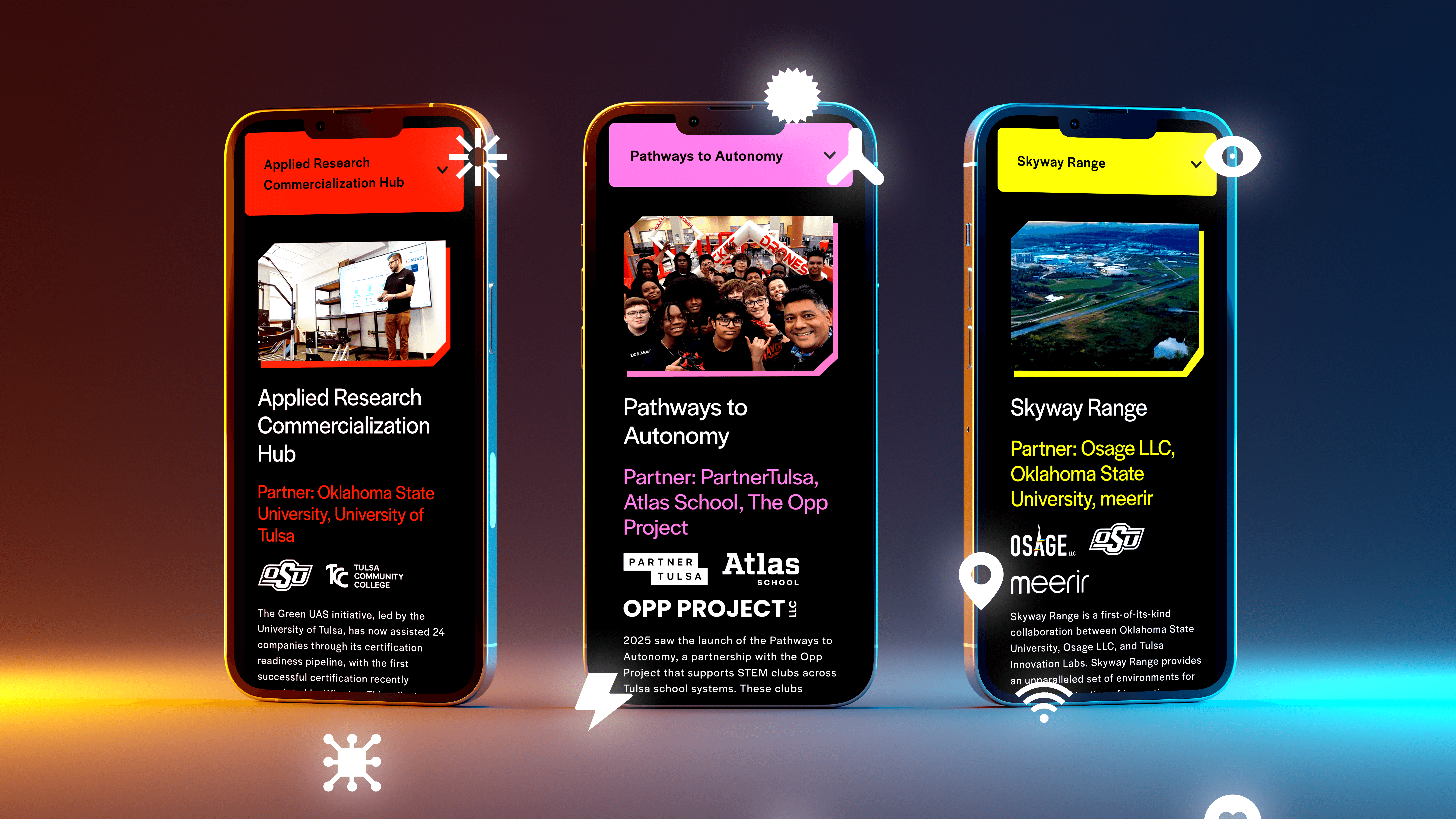
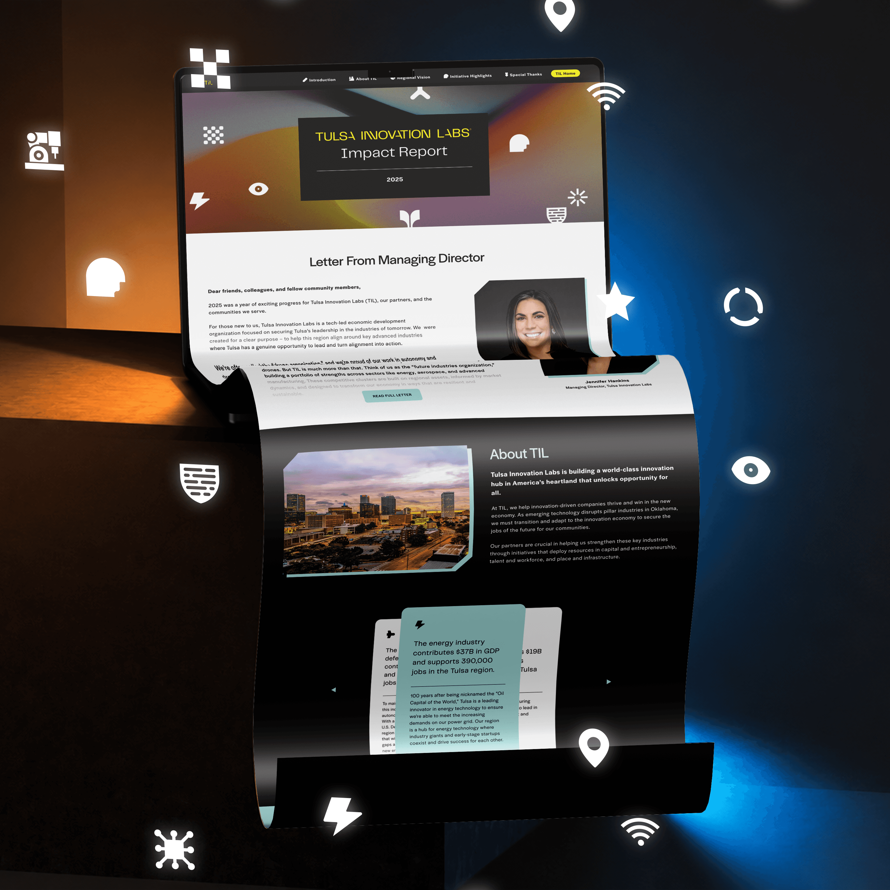
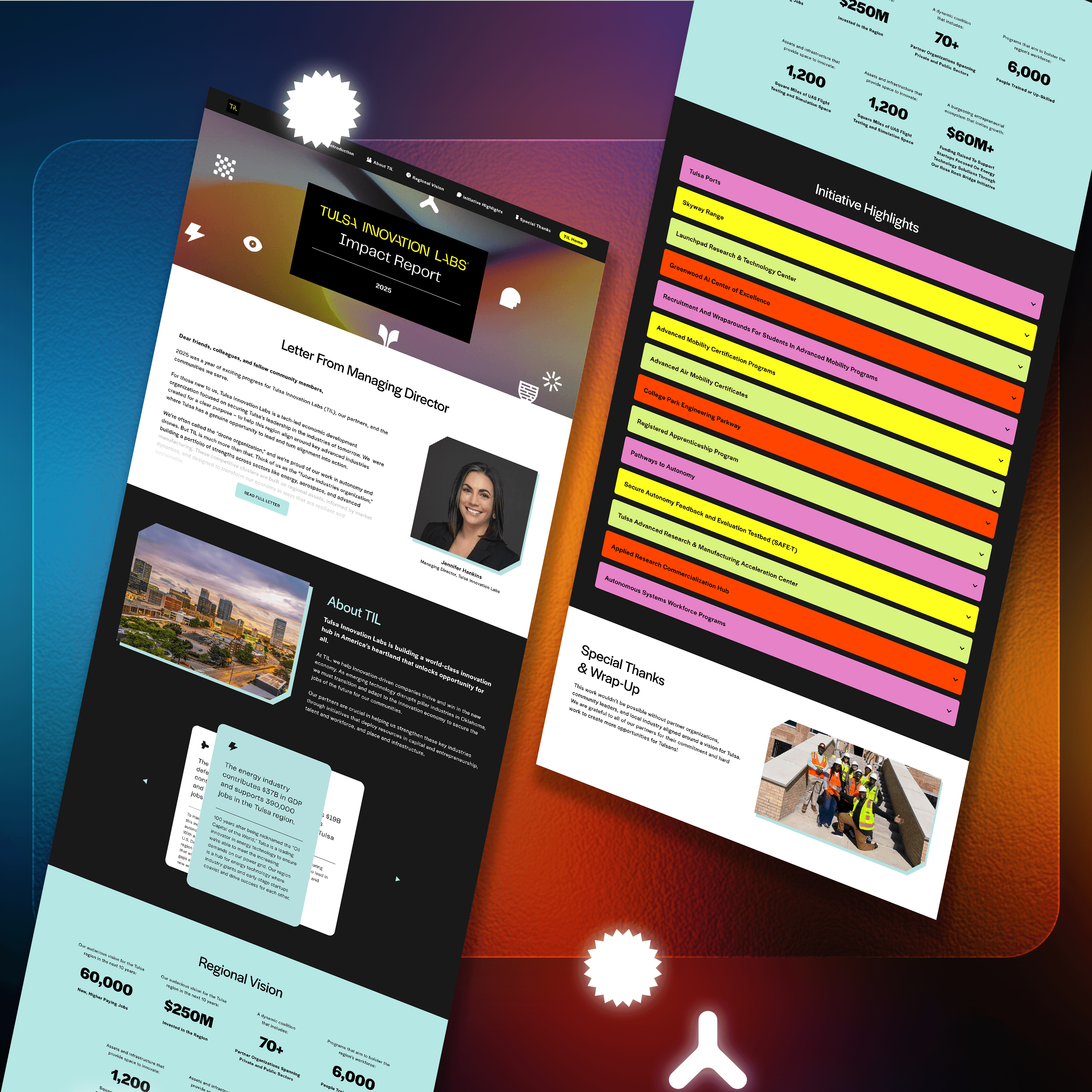
Digital Experience
We designed the full landing page across desktop, tablet, and mobile, with a sticky navigation system and a color-coded accordion structure that lets stakeholders drill into each initiative without losing context. Motion graphics were built for each accordion interaction, adding life to the moments that matter most. The report went from a document people skim to an experience people actually move through.
Credits
Creative Direction & Strategy - Pooyan Alizadeh
Static and Motion Design - George Mott
Website Design - Heather Flores