Phase 1
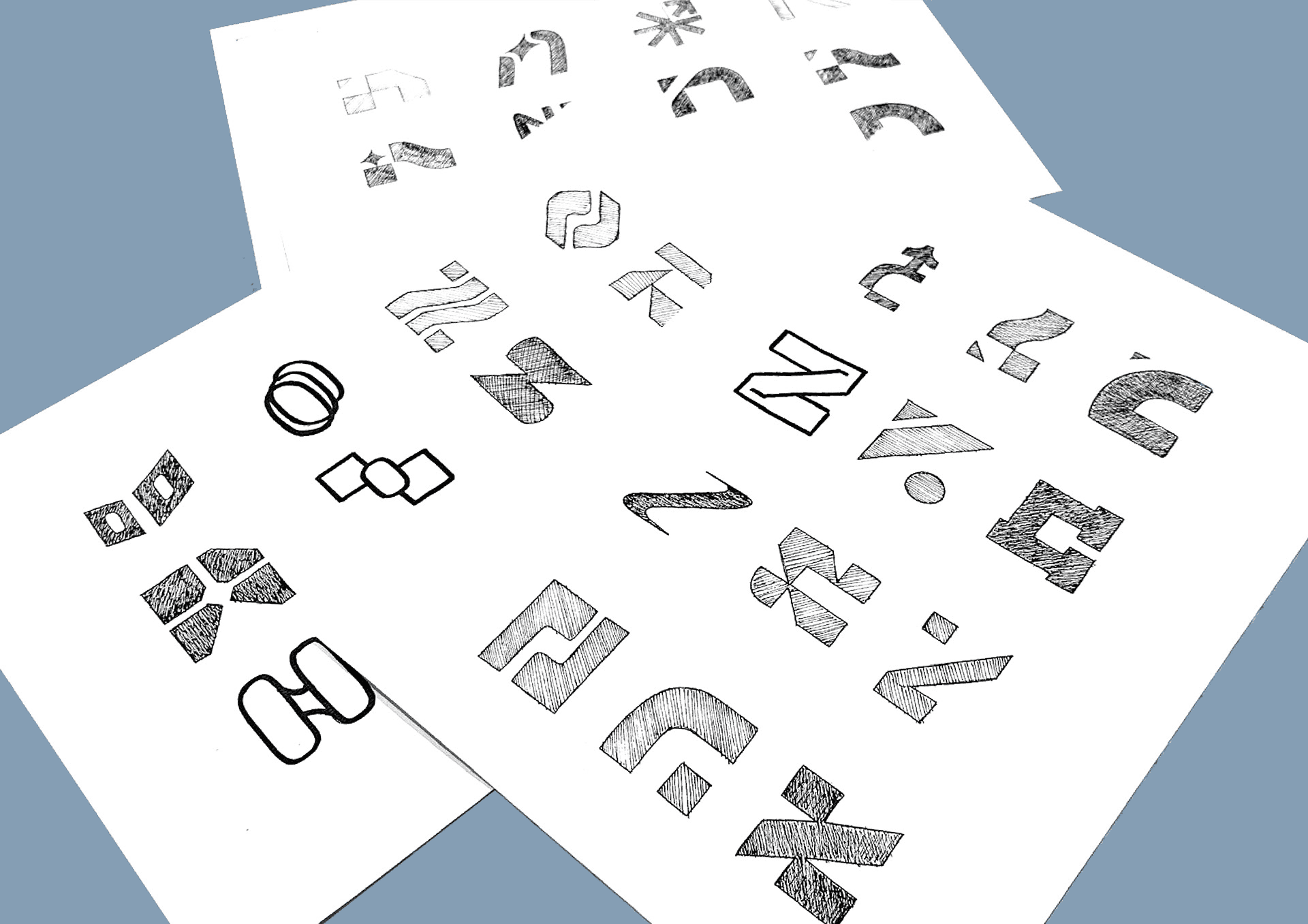
Logo Design
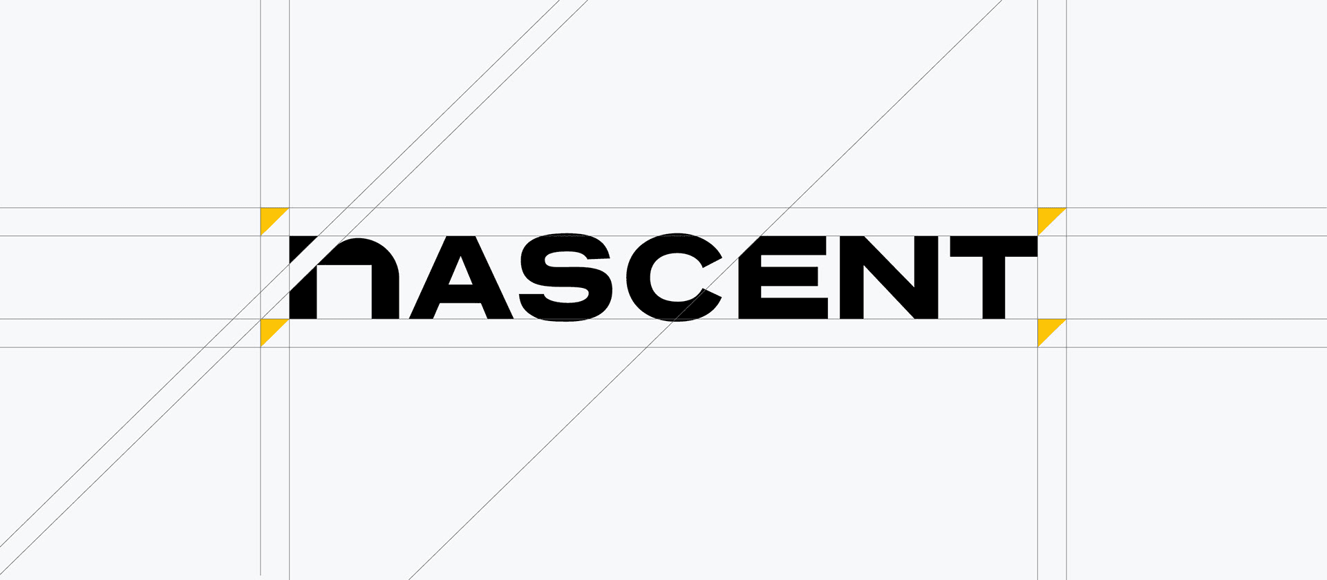
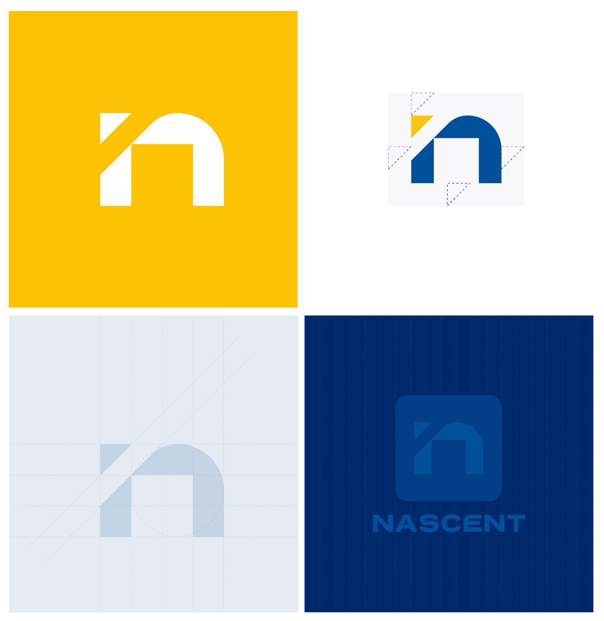
A mark engineered, not decorated.
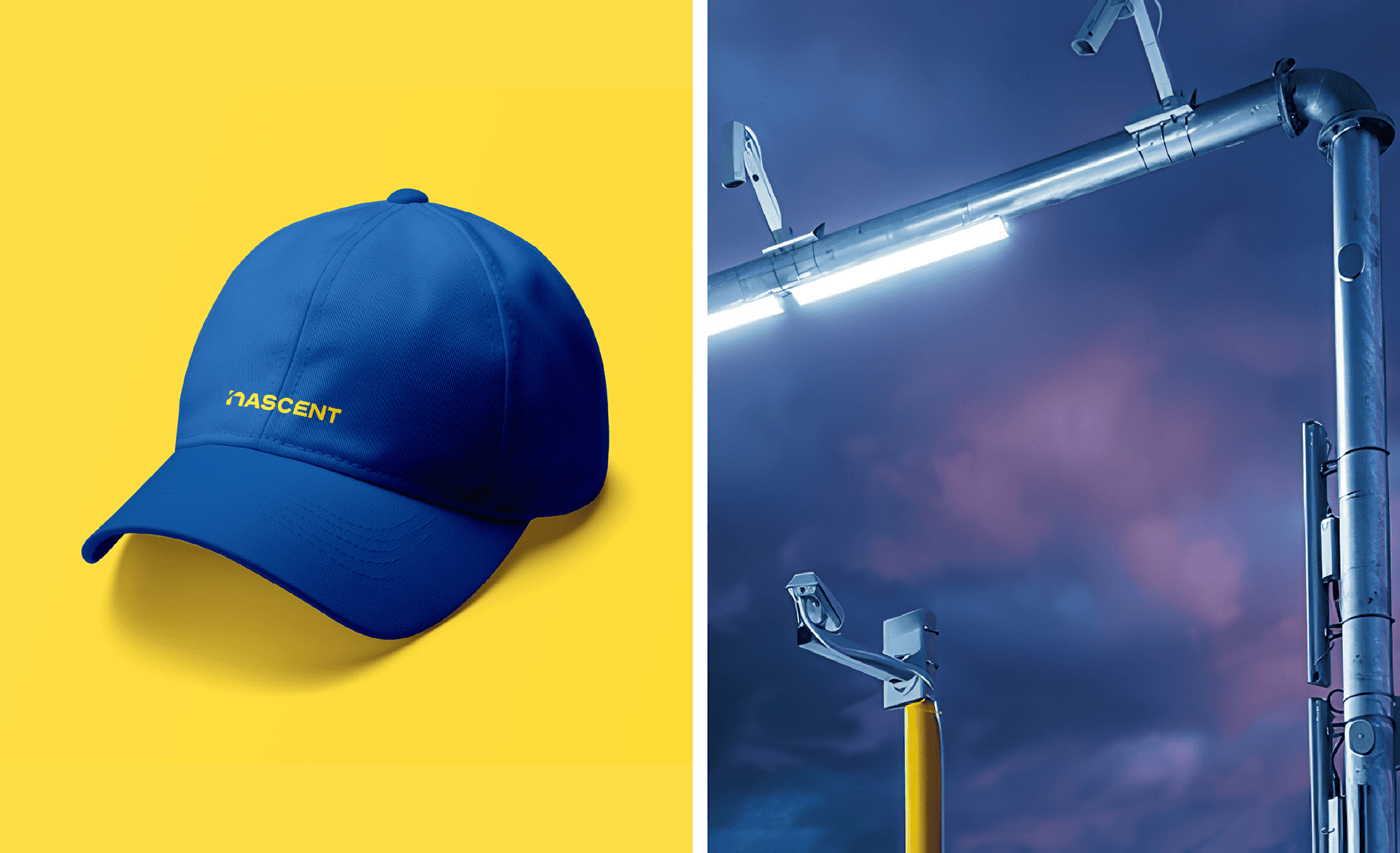
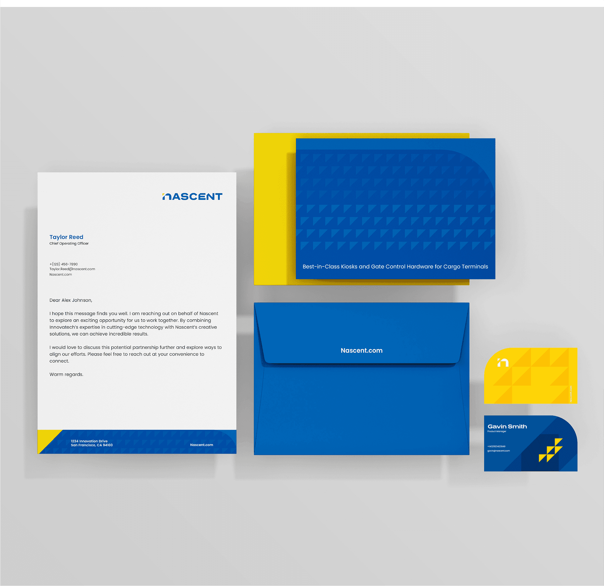
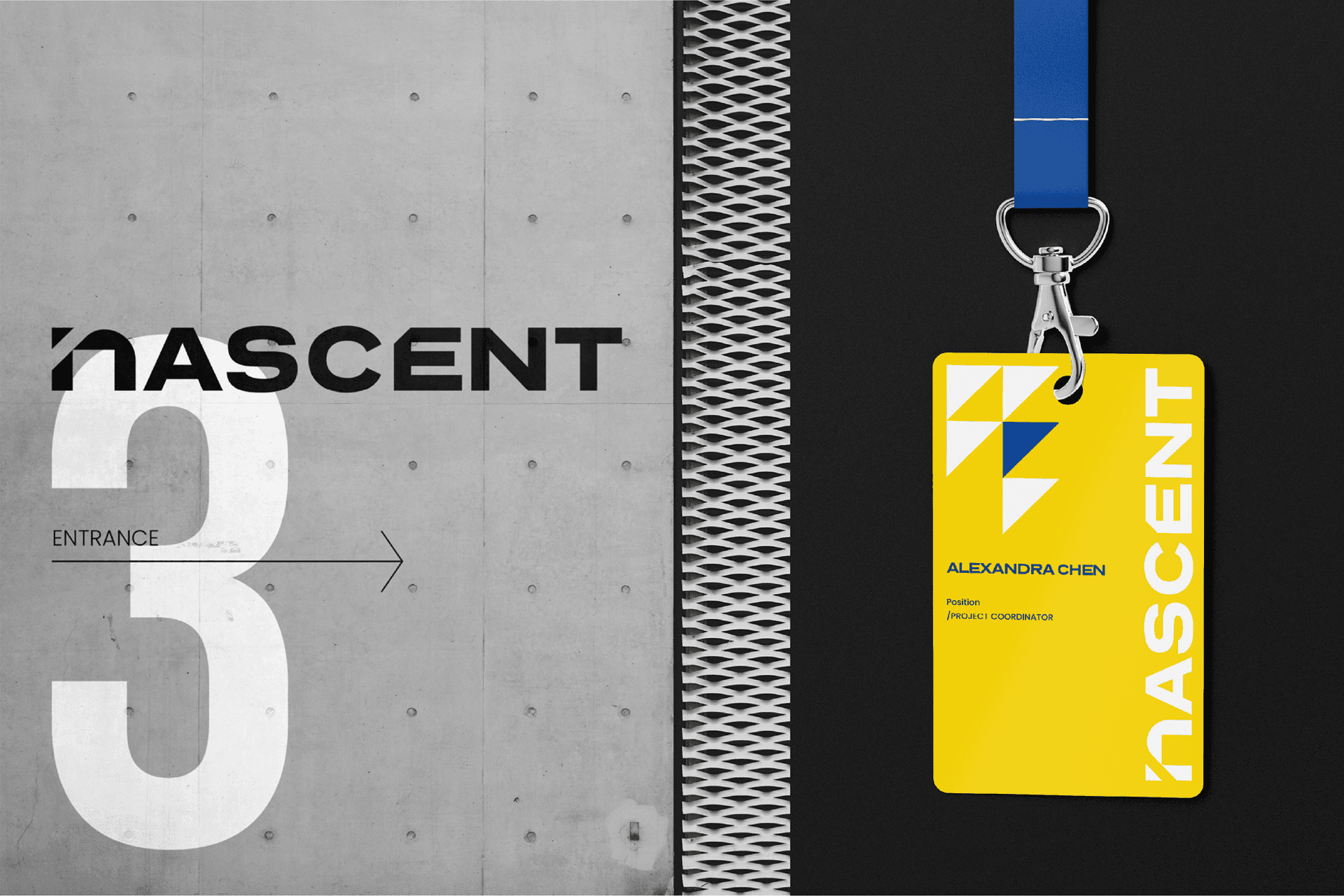
We made the logo geometric and heavy so it would hold at both ends of the range: a business card and the side of a shipping container. Precision and stability, tested in print, on screen, and on product hardware before it was approved.


Phase 2
Visual Identity
Industrial, not decorative.
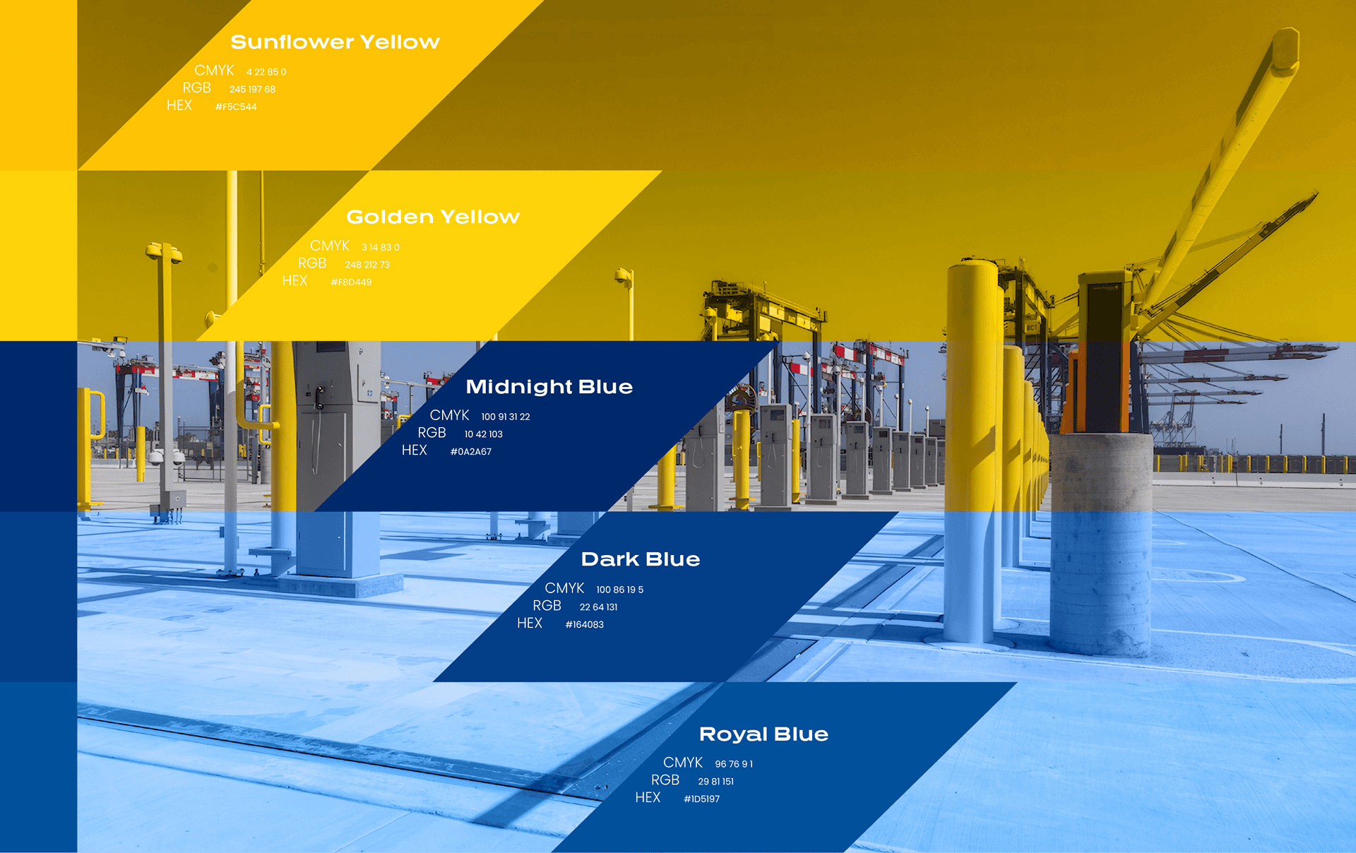
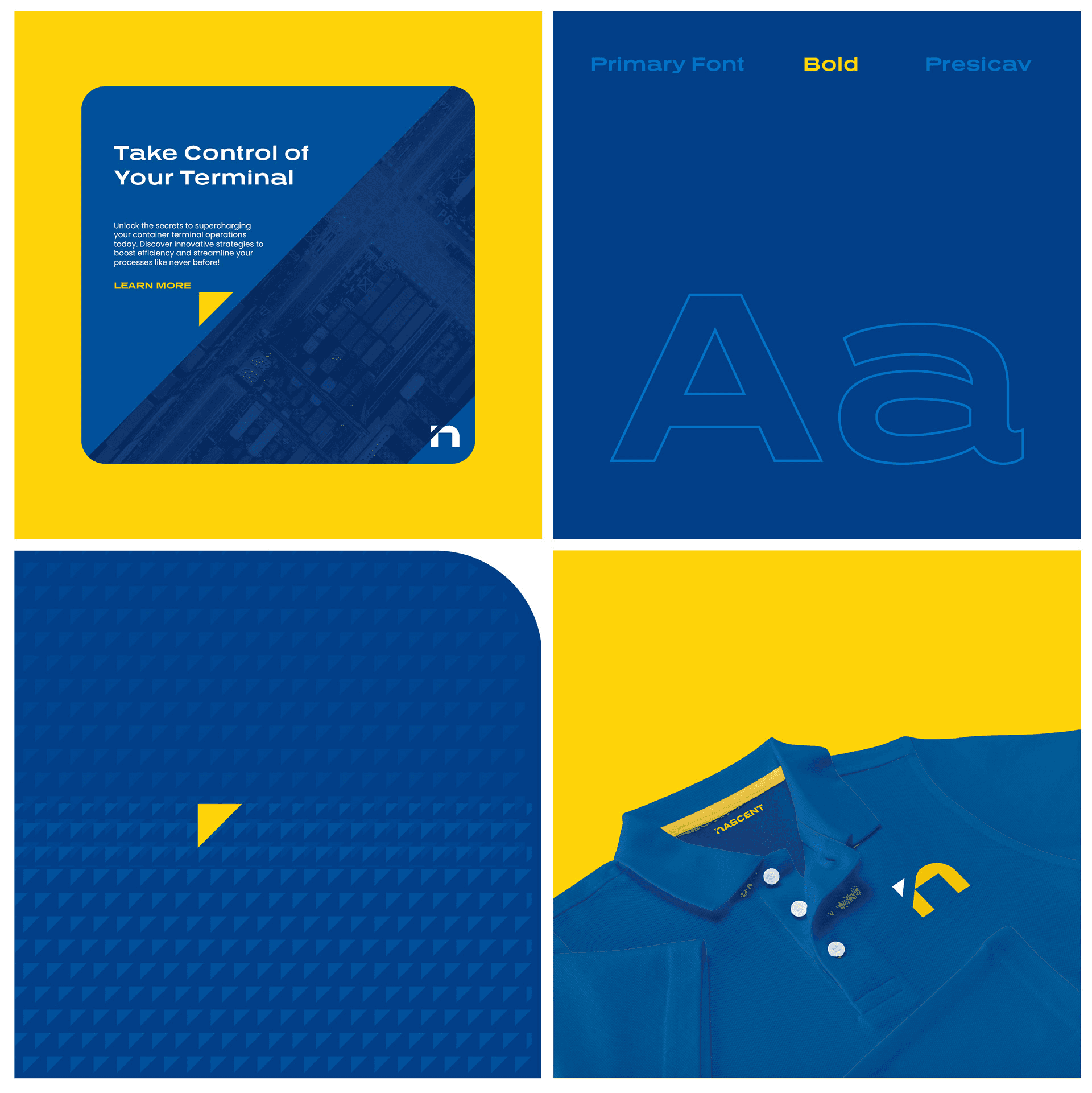
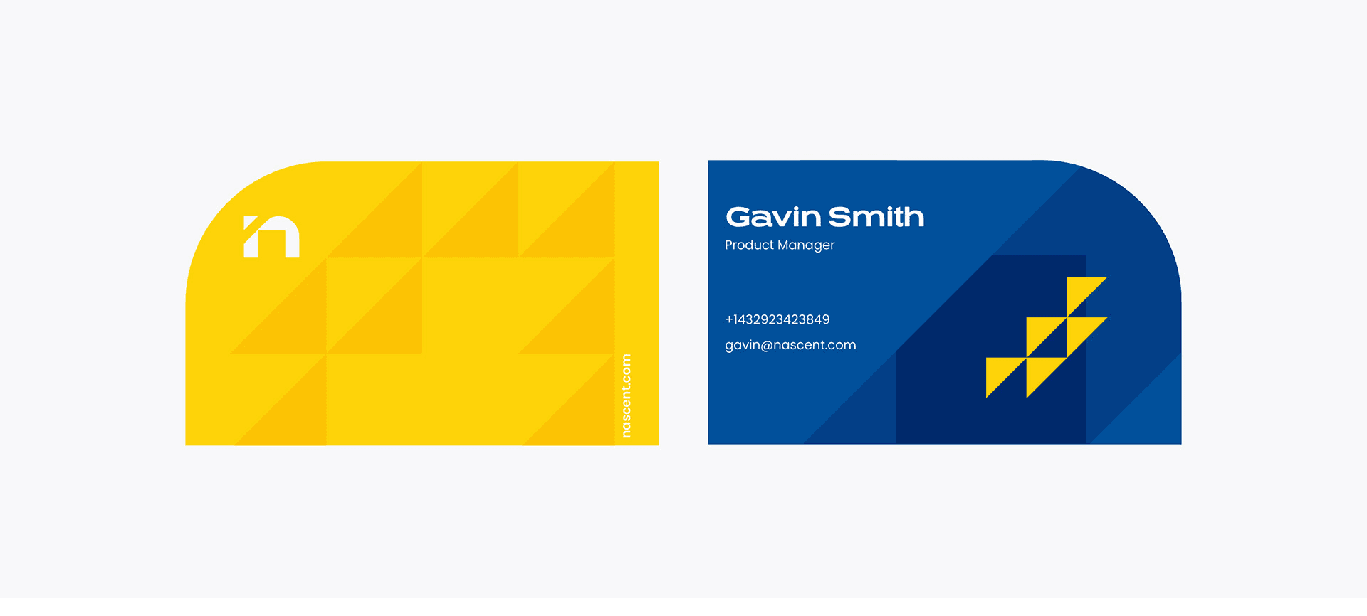
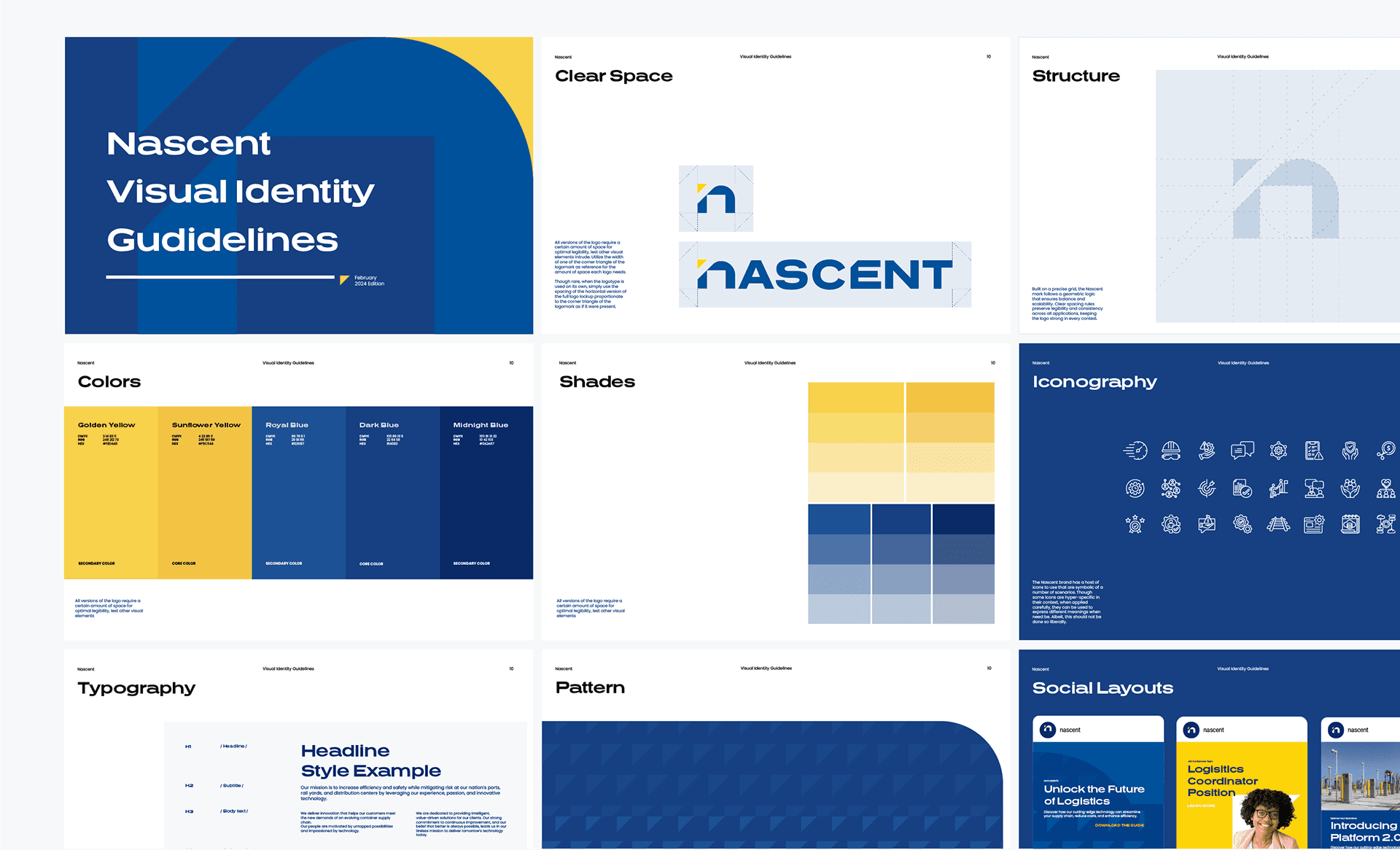
A modular grid, a reduced palette, typography chosen for function. Every element had to earn its place by doing a job. Nothing in the system was there to look designed.
Phase 3
Digital Presence
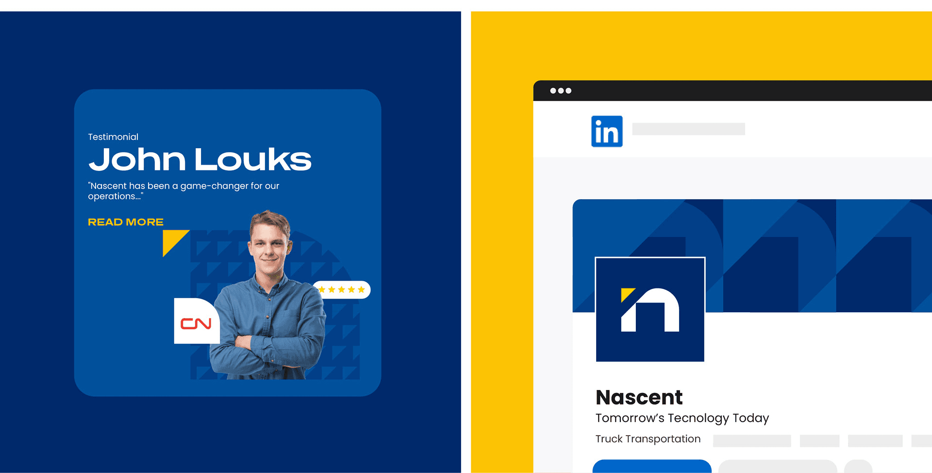
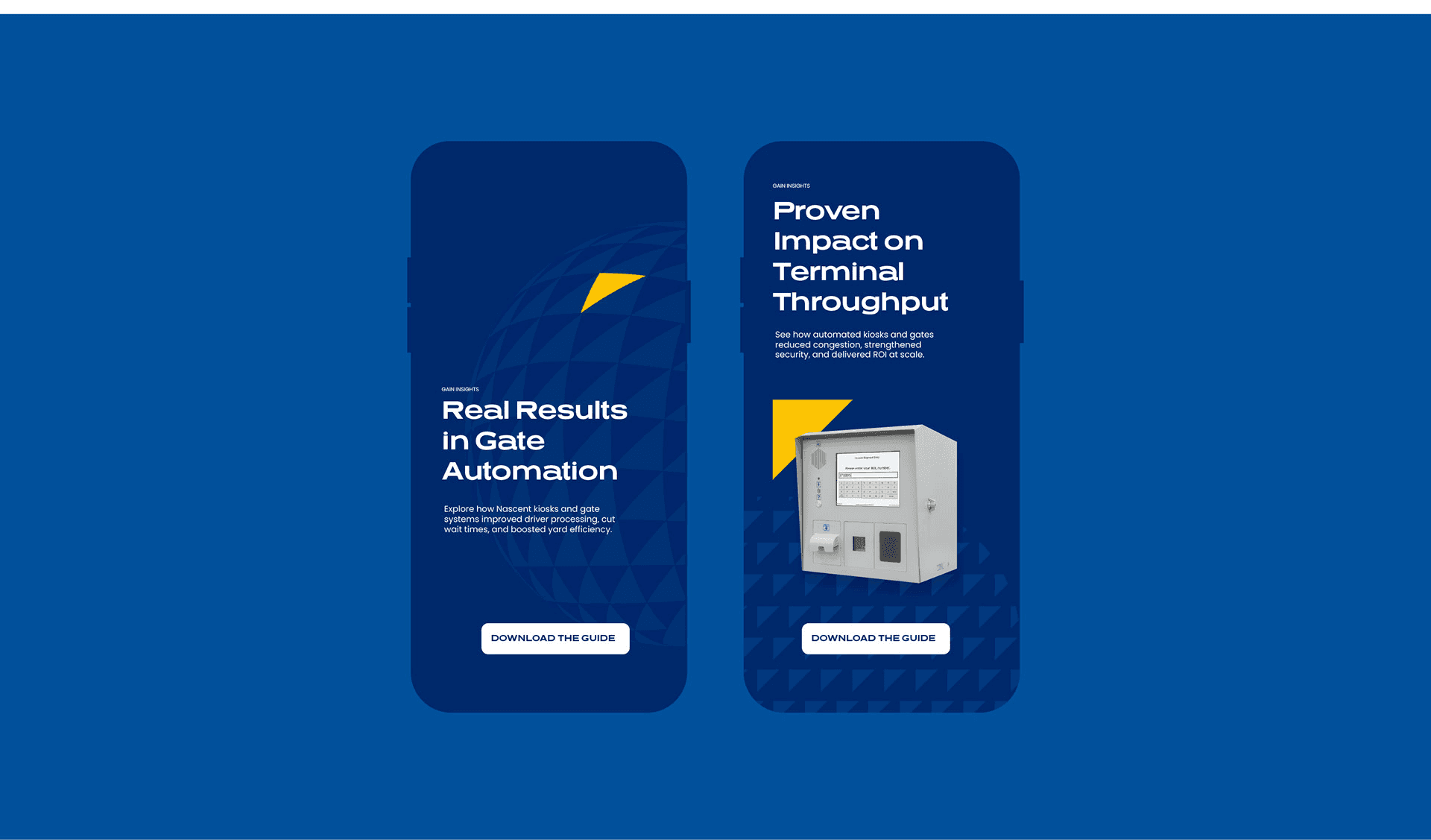
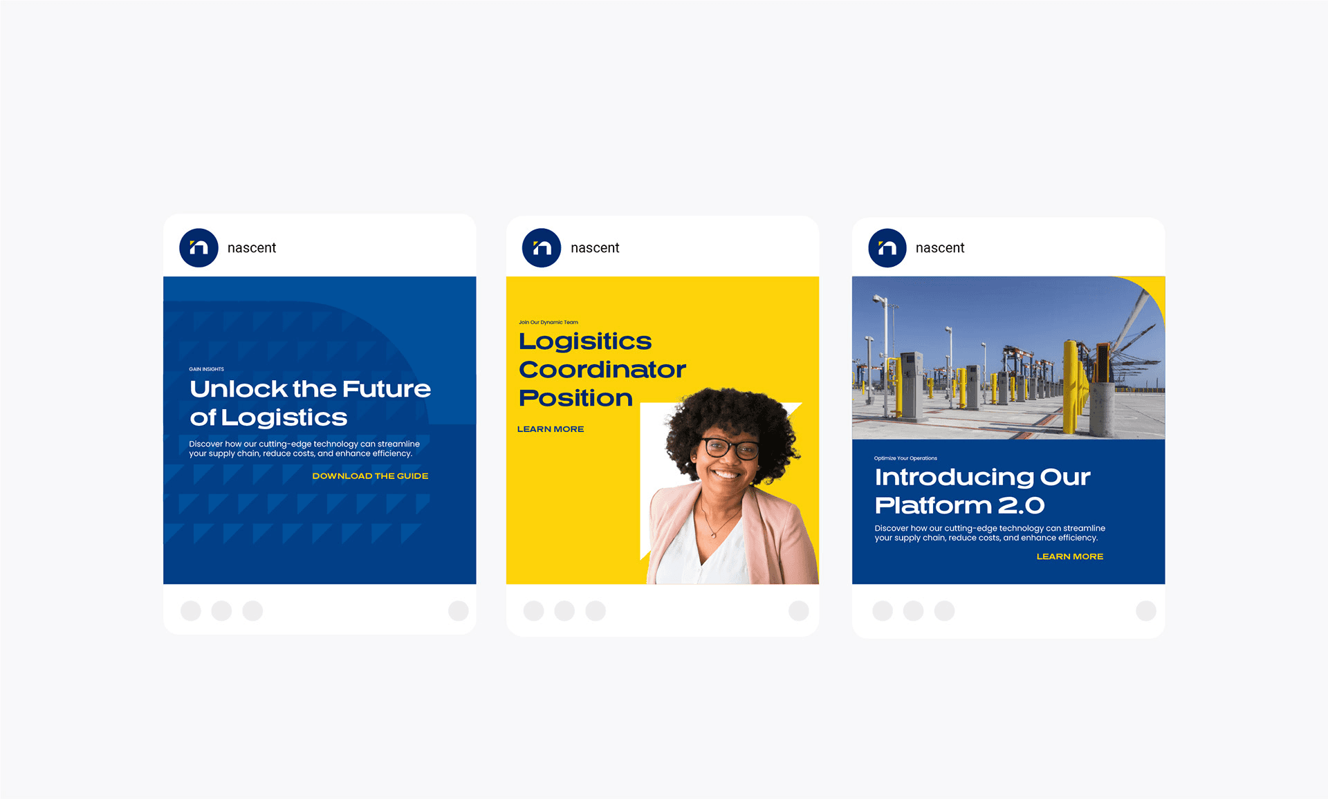
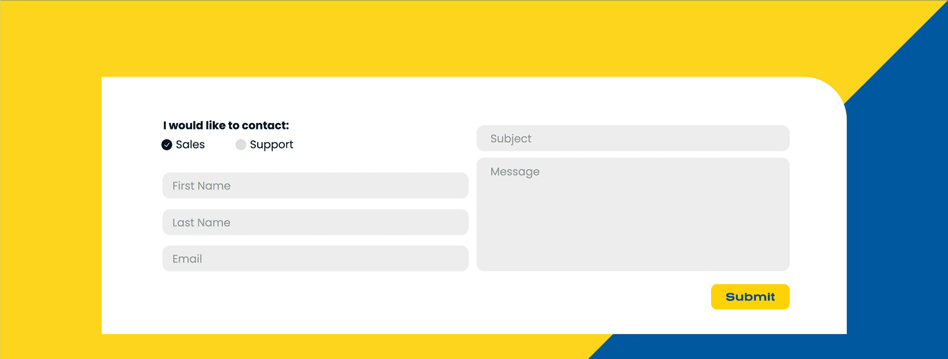
A responsive site, a social system a two-person team could run without me, and a motion language built around what Nascent actually sells: flow.




The Result
Nascent was acquired after launch. The identity wasn't replaced. The new owners expanded the partnership instead, which is the only endorsement of a rebrand that counts. 90+ deliverables across three phases, 12 creatives.
Credits
Creative Direction & Strategy - Pooyan Alizadeh
Logo & Branding - Ashton Nguyen
Website Design - Sarah Graf
Social Media Design - David Joshua Lee
Tradeshow Booth - Laura Faccone
Presentation Design - Ali Kavousi
Animation & Motion Graphics - Hayley Nelson